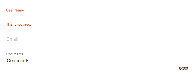
The angular material input-container is a used to contains any <input> or <textarea> element as a child. It also supports error handling using ng-message directives and animates messages using ngEnter / ngLeave events or ngShow / ngHide events.
The following table lists the parameters and descriptions of many attributes of the md-input-container.
| Parameters | Description |
|---|---|
| md-maxlength | The working of md-maxlength is to show the full-length text. If you do not want counter text and only require “plain” verification, you can use “simple” NG-Maxlometer features. |
| aria-label | It is used when the label is not present there. A warning message is seen in the console if the label is not present. |
| placeholder | A placeholder is an approach that is used where the label is not present. |
| md-no-auto grow | When md-no-auto grow will present there, textareas will not grow automatically. |
| md-detect-hidden | Textarea will be the same size as it appears after being hidden when md-detect-hidden present. It is, by default, reverses every reflex cycle. |
<input> and <textarea> Attributes
The attributes that are used with normal <input> and <textarea> elements can be used with elements inside <mat-form-field>. It has Angular directives such as ngModel and formControl.
Supported <input> Types
The following input types are used with matInput:
- month
- number
- color
- date
- datetime-local
- password
- search
- text
- urltime
- time
- week
- datetime-local
Form Field Features
There are a number of <mat-form-field> features that can be used with <textarea matInput>. They are error messages, hint text, prefix, suffix, and theming.
Placeholder
The placeholder text is shown when the input is empty and the label <mat-form-field> is floating. It is used to give the user hint about typing in the input. The placeholder can be specified by setting a placeholder text on the <input> or <textarea> element.
Changing when the error messages are shown
<mat-form-field> allows us to associate error messages with matInput. When the control is invalid then an error message will be shown, and either the user has interacted with the element, or the original form has been rendered.
Example
The below example shows the use of md-input-container directive and the uses of inputs.
am_inputs.htm
<html lang = "en">

   <head>

      <link rel = "stylesheet"

         href = "https://ajax.googleapis.com/ajax/libs/angular_material/1.0.0/angular-material.min.css">

      <script src = "https://ajax.googleapis.com/ajax/libs/angularjs/1.4.8/angular.min.js"></script>

      <script src = "https://ajax.googleapis.com/ajax/libs/angularjs/1.4.8/angular-animate.min.js"></script>

      <script src = "https://ajax.googleapis.com/ajax/libs/angularjs/1.4.8/angular-aria.min.js"></script>

      <script src = "https://ajax.googleapis.com/ajax/libs/angularjs/1.4.8/angular-messages.min.js"></script>

      <script src = "https://ajax.googleapis.com/ajax/libs/angular_material/1.0.0/angular-material.min.js"></script>

      <link rel = "stylesheet" href = "https://fonts.googleapis.com/icon?family=Material+Icons">

      <style>

      </style>

      <script language = "javascript">

         angular

            .module('firstApplication', ['ngMaterial'])

            .controller('inputController', inputController);

         function inputController ($scope) {

            $scope.project = {

               comments: 'Comments',

            };

         }

      </script>

   </head>

   <body ng-app = "firstApplication">

      <div id = "inputContainer" class = "inputDemo"

         ng-controller = "inputController as ctrl" ng-cloak>

         <md-content layout-padding>

            <form name = "projectForm">

               <md-input-container class = "md-block">

                  <label>User Name</label>

                  <input required name = "userName" ng-model = "project.userName">

                  <div ng-messages = "projectForm.userName.$error">

                     <div ng-message = "required">This is required.</div>

                  </div>

               </md-input-container>

               <md-input-container class = "md-block">

                  <label>Email</label>

                  <input required type = "email" name = "userEmail"

                     ng-model = "project.userEmail"

                     minlength = "10" maxlength = "100" ng-pattern = "/^.+@.+\..+$/" />

                  <div ng-messages = "projectForm.userEmail.$error" role = "alert">

                     <div ng-message-exp = "['required', 'minlength', 'maxlength',

                        'pattern']">

                        Email must be between 10 and 100 characters long and should

                        be a valid email address.

                     </div>

                  </div>

               </md-input-container>

               <md-input-container class = "md-block">

                  <label>Comments</label>

                  <input md-maxlength = "300" required name = "comments"

                     ng-model = "project.comments">

                  <div ng-messages = "projectForm.comments.$error">

                     <div ng-message = "required">This is required.</div>

                     <div ng-message = "md-maxlength">The comments has to be less

                        than 300 characters long.</div>

                  </div>

               </md-input-container>


            </form>

         </md-content>

      </div>

   </body>

</html>
Output:

Leave a Reply